
⛅ The Weather Channel Radar
Goal
Create an improved user-friendly UI for The Weather Channel’s award-winning Premium Radar feature, with cross-platform alignment for iOS, Android, & Web.
Role
Product Designer
Softwares
Sketch | Invision | Jira
Duration
Jan 2021 - Jan 2022

Overview
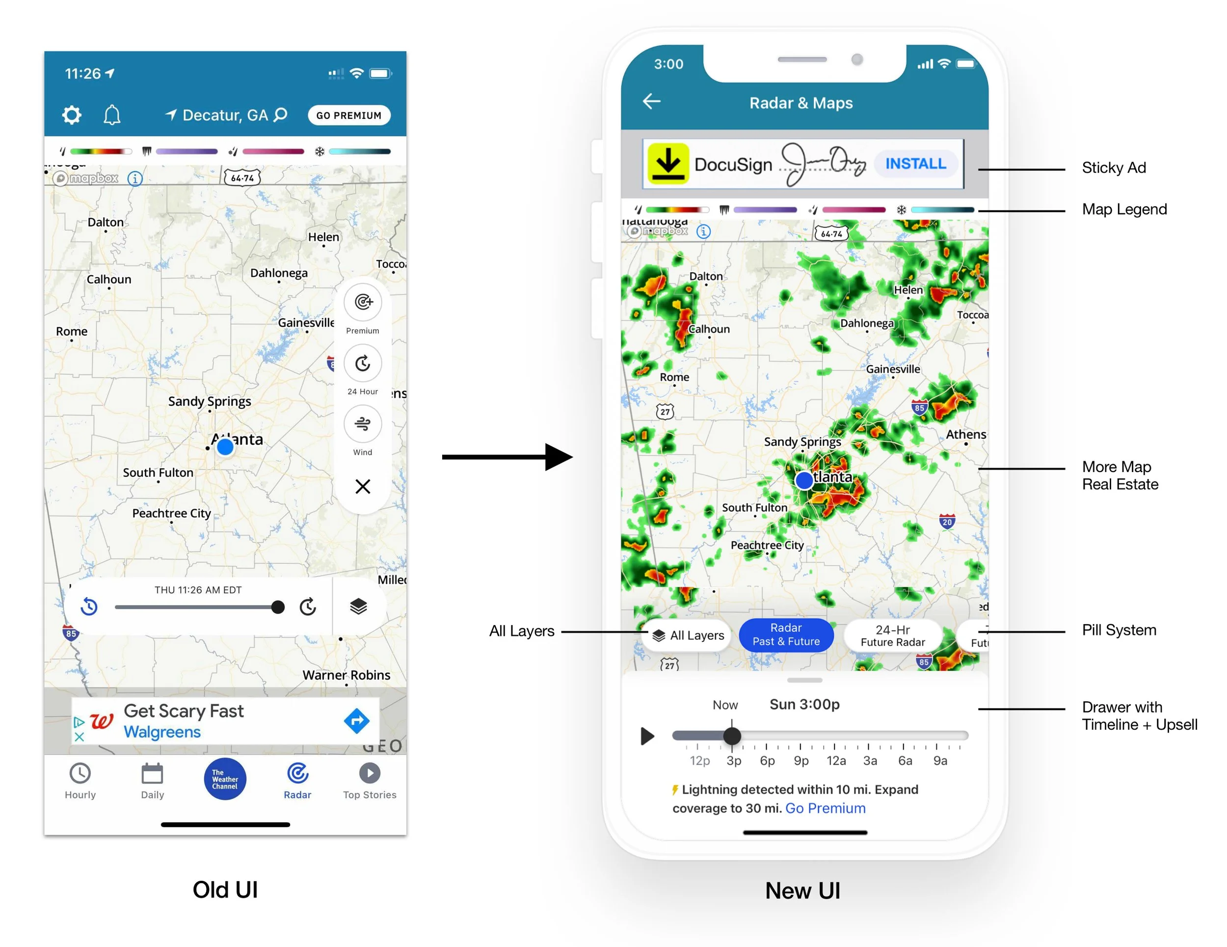
Digging into user feedback, a clear pattern emerged: our existing Radar page had significant gaps. Users struggled to navigate the timeline, couldn't find the layers feature, and were largely unaware of the differentiators hidden behind an obscure button.
This project set out to fix that — adding meaningful value to the experience and building equity in the drawer across every platform. The goal was to modernize Radar end-to-end, and use the intersection of storytelling, data, and innovation to educate and inspire users — cementing The Weather Channel as the market leader in perceived accuracy and precipitation storytelling.

Increasing User Value
We cleared the map canvas by removing the floating action button and timeline, letting the data take center stage. In its place, we introduced a Carousel Pill System - a streamlined navigation layer with four default options: Basic 8-Hour Radar, 24-Hour Future Radar, 72-Hour Future Radar, and Layers / Overlays / Map Settings.
The timeline relocated to the drawer, which became a natural home for editorial content, severe weather updates, and premium upsells - creating a low-friction pathway for users to discover and purchase a Premium Subscription.
"Radar usage within the app increased almost 2.5x, from 100M to 250M per month. We believe that radar is our single biggest opportunity to solve in a competitive weather market landscape."


To ease users into the new UI, we introduced contextual onboarding tooltips that guide them through the experience step by step - reducing friction and ensuring no one feels lost or overwhelmed. We also launched a GPS feature that gives users a reliable way to return to their original map position after exploring. To keep the interface clean, the GPS icon appears only when a user has navigated away from their current location.

This project offered great cross-functional collaboration - working closely with Developers, QA Engineers, and Product Managers, and presenting to Leadership. The real-time screen share sessions with our developers were a highlight, ensuring a pixel-perfect implementation that our users deserve. I'm proud of the result and how effectively we worked together to get there.
